


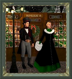
The picture above is larger and thus more suitable for an opening page. Here is also a small image if you wish to use it on other pages.
The font used here is called "Splendid Ornamenty" size 22. The colour used is #222C24 with the bladepro setting "cutout" added at a setting of +100 and then the word layer duplicated two more times for emphasis
You
can check out the source to see how the page has been laid out. That's how I learned--by taking advantage of others'
expertise and their willingness to share. If you copy my layout, please make sure you remove the links at the bottom
that have to do with my site statistics. You can use this set
without a link back to this site.
|
|