
Several people have asked me if I would explain how I use the illumination effect to light up ceiling lights or track lighting.
Let me say up front, that I am no expert at this and what I have learned is strictly by trial and error. I first began thinking that I could only use this effect on a single layer after I had merged my image at the end. That way I could see my whole image in the "lights" window and just play around until I got something I liked.
Then, on one of my Christmas sets, I wanted to light up the chandelier, but not have it affect the whole image. I went to the lights window and saw only my chandelier and none of the other layers. My first thought was "forget this - I can't see what I'm doing". Then I hit on the idea of clicking and dragging the lights window off to the side of the screen, having a quick look at my main image, and then immediately dragging the window back to the centre. From that little discovery, I started using the illumination effect on lots of layers wherever I felt it made a difference.
I stuck to the presets at first and then I got braver and went to "custom" and started moving, changing and experimenting. Believe me, that is the only way to see what happens and you should never be afraid to see for yourself because you can always click cancel or undo.
This was the first image where I did the whole "custom" routine strictly on my own.
Well, let's get started and have some fun together. We will work on an image I created so if you would like to use it again, feel free to do so.
I place absolutely NO restrictions on the use of this tutorial or your finished image, except for reproducing the tutorial on your own site without permission or claiming it as your own.
This tutorial was completed using PSP7.
What You Will Need:
Paint Shop Pro: download a trial version here
Zip of my image files: you can download it here
PLEASE save your work often if you are using this effect in a different image!! I always do it after every layer. It is better to be safe than sorry.
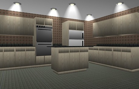
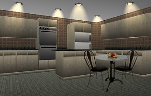
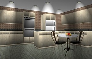
(1) Open up the kitchen image from the zip file.
(2) Go to Effects - illumination - lights.
When the window opens there are lots of settings there to play with.
Look at the images below and for a quick explanation "in my words" of what the settings are.
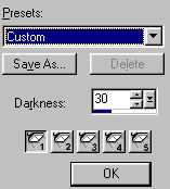
The upper left is the presets for your effects.
The darkness is the setting for the whole image where the lights don't shine.
The five buttons are for the 5 lights you have available to use.
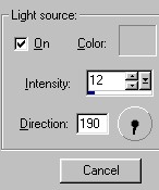
Light source button must have a check mark in it for it to be on.
The colour is the colour of the shadow that you can change at your discretion.
The intensity is the strength of the light.
The direction is the angle the light is pointing.
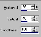
The horizontal is for moving the light left and right.
The vertical is for moving the light up and down.
The smoothness is almost like going from choppy (0)to ultra smooth antialias(100).
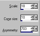
The scale is the size that makes the light larger but more up and down length.
The cone is the size that makes the light larger but more wide from left to right.
Assymetry is the shape starting from circular at lower numbers leading to long ovals at the larger numbers. If you wanted to do round lights for lamps or lampposts, numbers under 100 would be great for that effect.
(3) Go to the presets and click on "Custom". Then go down and click on light one. Go to the light source area and click in the "on" box. Then click on the colour box. When the colour window opens, take the shortcut and look to the upper left colour samples and click on the grey square directly above the white square. Click OK to apply.
Now go and do these same step for lights 2 to 5. Click on the light number, turn it on and set the colour.
(4) Return to light one by clicking on it.
If you want to experiment for a while, do it now and see what happens.
Then set your settings to the numbers I have used below for light 1.
Darkness : 37..........Intensity : 5..........Angle : 190..........
Horizontal : minus80
Vertical : minus65.....Smoothness : 80.....Scale : 12
.....Cone : 20.....Assymetry : 500
(5) Go to light two and click on it.
What we will change here are the angle, scale (need it a bit smaller for this light), and the horizontal and vertical positions.
Then set your settings to the numbers I have used below for light 2.
Darkness : 37..........Intensity : 5..........Angle : 183..........
Horizontal : minus24
Vertical : minus54.....Smoothness : 80.....Scale : 11
.....Cone : 20.....Assymetry : 500
(6) Go to light three and click on it.
What we will change here are the angle, scale (need it a bit larger again for this light), and the horizontal and vertical positions.
Then set your settings to the numbers I have used below for light 3.
Darkness : 37..........Intensity : 5..........Angle : 180..........
Horizontal : 4
Vertical : minus63.....Smoothness : 80.....Scale : 12
.....Cone : 20.....Assymetry : 500
(7) Go to light four and click on it.
What we will change here are the angle, the horizontal and vertical positions, and the cone size.
Then set your settings to the numbers I have used below for light 4.
Darkness : 37..........Intensity : 5..........Angle : 176..........
Horizontal : 30
Vertical : minus40.....Smoothness : 80.....Scale : 12
.....Cone : 18.....Assymetry : 500
(8) Go to light five and click on it.
What we will change here are the angle, the horizontal and vertical positions, and the cone size needs to be made larger.
Then set your settings to the numbers I have used below for light 5.
Darkness : 37..........Intensity : 5..........Angle : 170..........
Horizontal : 77
Vertical : minus63.....Smoothness : 80.....Scale : 12
.....Cone : 24.....Assymetry : 500
And there you have it. Click OK to apply and hopefully you are happy with the results.
Let me also say that if you like one of the presets, such as light from the top or bottom, you can go in and click on it, but then change the settings using it as a basis for your beginning. I do that quite often if I want the light softer or higher or more off to the side. I also change the colours quite often from that golden glow to beige or white or sometimes I have also used an olive green for effect.
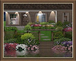
I hope this has helped you get a feel for using the illumination lights effect. I have shown more samples of how I have used it below.
One the one above I just added a table onto the same layer.
One the one above I changed the darkness to 30 making it a little lighter and the light colour to white.
On the one above I changed the darkness to 46, intensity 8, scale 50, cone 7 and assymetry 703.
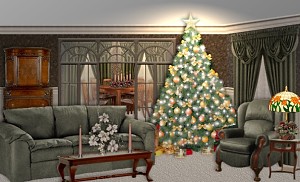
One the one above I did this in layers and added a light on the top of the tree on that layer, and a separate light on the table lamp.
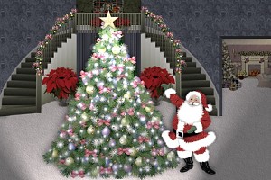
On the one above, I did a light on the top of the tree on that layer, then merged and added a light from the bottom on the merged final image.
If you have any problems or need further explanations, please feel free to email me here
TUTORIAL PAGE ONE
TUTORIAL PAGE TWO
TUTORIAL PAGE THREE
This tutorial was posted at the site of "P. Ann's Place" February 19, 2004 and written
by Pat Sherman.
All I ask is that you do not claim it as your own or post it on your site without permission.
If you are in a group and want to use this as a lesson, please use the link freely and you do not have to write me to ask permission.
  
|
|